Sunday, October 25, 2009

BiDi & Oh So Many Changes!

Bidi has finally landed after quite a wait this effort was contributed by Telmap and implemented mostly by Ofir Leitner.

Besides bidi Chen and myself committed allot of groundbreaking changes. Chen made some very significant performance improvements for LWUIT very noticeable in the Virtual Keyboard code. I committed more elaborate Scrollbar styling code, we now also have HorizontalScroll and can generally customize all aspects of a scroll/scroll thumb using the theme rather than using the old approach of look & feel override.

But the meat and potatoes of the commit is the bidi code... BiDi is the term refering to Bi-directional language support, generally RTL languages. There is plenty of information about RTL languages (Arabic, Hebrew, Syriac, Thaana) on the internet but as a brief primer here is a minor summary.

Most western languages are written from left to right (LTR), however some languages are normally written from right to left (RTL) speakers of these languages expect the UI to flow in the opposite direction otherwise it seems weird just like reading this word would be to most English speakers: "drieW".

The problem posed by RTL languages is known as BiDi (Bi-directional) and not as RTL since the "true" problem isn't the reversal of the writing/UI but rather the mixing of RTL and LTR together. E.g. numbers are always written from left to right (just like in English) so in an RTL language the direction is from right to left and once we reach a number or English text embedded in the middle of the sentence (such as a name) the direction switches for a duration and is later restored.

LWUIT's support for bidi includes the following components:

  • Bidi algorithm - allows converting between logical to visual representation for rendering
  • Globabl RTL flag - default flag for the entire application indicating the UI should flow from right to left
  • Individual RTL flag - flag indicating that the specific component/container should be presented as an RTL/LTR component (e.g. for displaying English elements within a RTL UI).
  • RTL text field input
  • RTL bitmap font rendering

Most of LWUIT's RTL support is under the hood, the LookAndFeel global RTL flag can be enabled using:
UIManager.getInstance().getLookAndFeel().setRTL(true);

(Notice that setting the RTL to true implicitly activates the bidi algorithm).

Once RTL is activated all positions in LWUIT become reversed and the UI becomes a mirror of itself. E.g. A softkey placed on the left moves to the right, padding on the left becomes padding on the right, the scroll moves to the left etc.
This applies to the layout managers (except for group layout) and most components. Bidi is mostly seamless in LWUIT but a developer still needs to be aware that his UI might be mirrored for these cases.
Tuesday, October 20, 2009

Arrange It Like A Table, Introducing The Table Layout

In a recent post I discussed LWUIT 1.3's upcoming table component. This new component is based on a new underlying layout manager also introduced in LWUIT 1.3: the table layout.

The table layout is largely inspired by the HTML table tag and slightly by AWT's GridBagLayout.
The table layout is a constraint based layout (similar to the border layout) this means that unlike other layout managers that expect components to be added on their own:
container.addComponent(component);

The table layout container expects something like this:
container.addComponent(tableConstraint, component);

Notice that this syntax is optional if omitting the constraint a default behavior will ensue of placing the component in the next available cell.

The table layout will automatically size components to the largest preferred size in the row/column until running out of space, if the table is not horizontally scrollable this will happen when the edge of the parent container is reached (close to the edge of the screen) and further components will be "crammed together". Notice that all cells in the table layout are sized to fit the entire cell always. To align, or margin cell's a developer can use the methods of the component/Style appropriately.

A developer can provide hints to the table layout to enable spanning and more detailed column/row sizes using the constraint argument to the addComponent method. The constraint argument is an instance of TableLayout.Constraint that must not be reused for more than one cell, this will cause an exception.

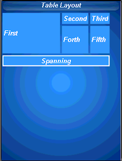
A constraint can specify the absolute row/column where the entry should fit as well as spanning between cell boundaries. Notice that in the picture the "First" cell is spanned vertically while the "Spanning" cell is spanned horizontally. This is immensely useful in creating elaborate UI's,

Constraints can also specify a height/width for a column/row that will override the default, this size is indicated in percentage of the total table layout size. In the picture you can see that the "First" label is sized to 50% width while the "Forth" label is sized to 20% height.

Form mainForm = new Form("Table Layout");
TableLayout layout = new TableLayout(4, 3);
mainForm.setLayout(layout);
TableLayout.Constraint constraint = layout.createConstraint();
constraint.setVerticalSpan(2);
constraint.setWidthPercentage(50);
mainForm.addComponent(constraint, new Label("First"));
mainForm.addComponent(new Label("Second"));
mainForm.addComponent(new Label("Third"));

constraint = layout.createConstraint();
constraint.setHeightPercentage(20);
mainForm.addComponent(constraint, new Label("Forth"));
mainForm.addComponent(new Label("Fifth"));
constraint = layout.createConstraint();
constraint.setHorizontalSpan(3);
Label span = new Label("Spanning");
span.getStyle().setBorder(Border.createLineBorder(2));
span.setAlignment(Component.CENTER);
mainForm.addComponent(constraint, span);
mainForm.show();

Wednesday, October 14, 2009

Tickering Everywhere

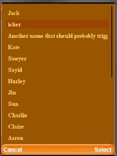
Its been a while since my original LWUIT ticker list post and quite a few has changed, back when I originally posted there was no built in tickering functionality in LWUIT itself. Recent questions in the mailing list and from partners prompted me to write the code bellow, generally for tickering a ComboBox however I tried to make it as generic as possible so it can be installed into every list out there.

Notice that to ticker custom components you need to set them as a cell renderer to prevent the label from throwing an exception when invoking startTicker. You can use the TickerRenderer bellow with practically every list and it doesn't need to be a part of a combo box.

public class TickerComboDemo extends MIDlet {
public void startApp() {
try {
Display.init(this);
Resources r = Resources.open("/javaTheme.res");
UIManager.getInstance().setThemeProps(r.getTheme(r.getThemeResourceNames()[0]));
Form form = new Form("Ticker Combo");
ComboBox combo = new ComboBox(new String[]{"Jack",
"Name that should probably trigger a ticker",
"Another name that should probably trigger a ticker",
"Kate", "Sawyer", "Sayid", "Hurley", "Jin", "Sun", "Charlie", "Claire",
"Aaron"
, "Michael", "Walt", "Boone", "Shannon", "Locke", "Mr. Eko",
"Ana-Lucia", "Libby", "Desmond", "Benjamin Linus", "Juliet Burke"}) {
protected List createPopupList() {
List l = super.createPopupList();
l.setListCellRenderer(new TickerRenderer());
return l;
}
};
form.addComponent(combo);
form.show();
} catch (IOException ex) {
ex.printStackTrace();
}
}

class TickerRenderer extends DefaultListCellRenderer {
private DefaultListCellRenderer selectedRenderer = new DefaultListCellRenderer(false);
private List parentList;
public TickerRenderer() {
super(false);
}

public boolean animate() {
if(parentList != null && parentList.getComponentForm() != null) {
if(selectedRenderer.isTickerRunning()) {
if(selectedRenderer.animate()) {
parentList.repaint();
}
}
}
return super.animate();
}

public Component getListCellRendererComponent(List list, Object value, int index, boolean isSelected) {
if(isSelected) {
selectedRenderer.getListCellRendererComponent(list, value, index, isSelected);

// sometimes the list asks for a dummy selected value for size calculations and this might
// break the tickering state
if(index == list.getSelectedIndex()) {
if(selectedRenderer.shouldTickerStart()) {
if(!selectedRenderer.isTickerRunning()) {
parentList = list;
list.getComponentForm().registerAnimated(this);
selectedRenderer.startTicker(UIManager.getInstance().getLookAndFeel().getTickerSpeed(), true);
}
} else {
if(selectedRenderer.isTickerRunning()) {
selectedRenderer.stopTicker();
}
}
}
return selectedRenderer;
} else {
return super.getListCellRendererComponent(list, value, index, isSelected);
}
}
}

public void pauseApp() {
}

public void destroyApp(boolean unconditional) {
}
}

Monday, October 12, 2009

LWUIT Binaries Are Now At java.sun.com Only

Our binaries are no longer hosted on java.net to avoid confusion between the binary drops and the source version. All of LWUIT binary elements are now a part of the new LWUIT product page at java.sun.com.
The java.net project home page and forum are still the development hub for discussion and ongoing development.

Thursday, October 8, 2009

Coordinating That Layout

Chen & myself are huge advocates of placing everything within LWUIT using layout managers, maybe its due to our Swing background and maybe its just our bad experience with the unique ways in which phones break when placing things absolutely.

A common request from users after LWUIT 1.0 was published was for a means of placing a component at an X/Y coordinate. We generally avoided that, since it doesn't make much sense. In that case why not just use Graphics, images etc.

We did however see two minor use cases for coordinate layouts, the ability to place elements in elaborate structures and the ability to place components one on top of the other (z-ordering). Notice that z-ordering can be achieved with other layout managers (in theory) but its not currently supported by any other layout.

Unlike an "absolute layout" that would just take X/Y coordinates and place a component within them, the coordinate layout "shifts coordinates" based on the amount of space it has available. E.g. in a 240x320 phone the size of the content pane might change for the following reasons:
  • Different font size for the title/soft button areas.
  • Signal/battery status on the top of the screen is shown by some operator firmwares even in game canvas!
  • Rotation of the screen for newer devices
  • Virtual keyboard opening on some devices
Etc.

So you would need to constantly check and recalculate coordinates in order to make sure that they are correct if you were to use an "absolute layout". Coordinate layout does that check for you and lays out the components in the proper positions based on your intentions.

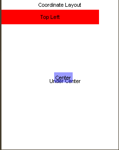
The following code produces the image you see above I will commit it to my incubator project soon:
mainForm.setLayout(new CoordinateLayout(200, 200));

Label centeredLabel = new Label("Center");
centeredLabel.setX(90);
centeredLabel.setY(90);
centeredLabel.getUnselectedStyle().setBgTransparency(100);
centeredLabel.getUnselectedStyle().setBgColor(0xff);

Label underCenter = new Label("Under Center");
underCenter.setX(80);
underCenter.setY(95);

Label top = new Label("Top Left");
top.setAlignment(Component.CENTER);
top.setX(0);
top.setY(0);
top.setPreferredW(200);
top.setPreferredH(30);
top.getUnselectedStyle().setBgColor(0xff0000);

mainForm.addComponent(underCenter);
mainForm.addComponent(centeredLabel);
mainForm.addComponent(top);

Notice several things:
  • We create a coordinate layout in 200x200 rather than screen resolution, these are "virtual" coordinates and they would be adapted to actual coordinates when the layout occurs. We can now "assume" that our resolution will always be 200x200.
  • Preferred size is used for all the components, we can determine absolute (unscaled size in pixels) using setPreferredSize
  • Alignment etc. still works just as expected
  • Z-order is determined by the order of addition to the container and is quite trivial using coordinate layout
BTW java.net is experiencing some issues this week with a DOS attack, read more about it in Terrences blog.